Whenever I’ve talked to someone else who writes a drawing interface like this, it seems like they always say text is the hardest part. But obviously, I’m built different, right?
Last time, I integrated gradients more completely into my piet-hardware crate. Today, we’re moving onto a subject that’s much more likely to be bad for my blood pressure: text rendering!
For the most part, I offload text loading, shaping and rendering onto the cosmic-text crate. It’s a pretty complete implementation of the whole “text” thing. Not to mention, it’s been created by people far smarter than I am.
So far, it’s worked well. In my limited tests, it’s created a decent layout system for text. The rendering has also worked out pretty well.
Unfortunately, especially when it comes to the GPU backend, there’s a lot of things that we have to take care of. Principally, the piet text API needs to be translated to cosmic-text calls. I’ve created a crate to handle this translation: piet-cosmic-text. But I’ve long suspected that something is wrong.
There’s also the fact that we need to draw the text onto the window. By default, cosmic-text draws to an array of pixels, but that doesn’t translate well to OpenGL. What I do is render those pixels to a texture, and then draw portions of that texture to the screen. This technique is called texture atlassing, and it’s very common when using this kind of drawing code.
So! Without further ado, let’s find out what’s gone wrong.
Number 5: Coloring Cascade
The purpose of this one, I think, is to test how text rendering deals with multiple colors and styles in one block of text. Here’s the reference image from piet-cairo:
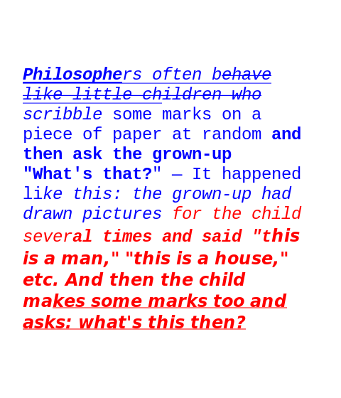
Here’s what piet-glow and piet-wgpu spit out:

Right! A few issues I can spot right off the bat:
- The text is too big.
- The text stops being blue way too soon.
- The font is too bold throughout.
The first one seems like the easiest to tackle. In the code for piet-cosmic-text, there’s a function for converting the piet font size to the cosmic-text font size:
fn points_to_pixels(points: f64) -> f64 {
    points * 96.0 / 72.0
}
This seems to be making it too big, so maybe I remove the ratio?
fn points_to_pixels(points: f64) -> f64 {
    points
}
This seems to go the other way; the output is now too small?
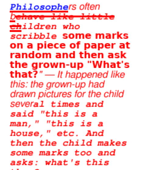
It looks like the ratio depends on the DPI of the screen, which varies from place to place. If you don’t have access to that information, you should assume that it’s 96 DPI. So, what I was doing originally was right?
To me it seems like this should be an adjustable option on the part of the user. The windowing framework is generally what controls the DPI, so it should be able to tell the drawing code what it is. So far winit doesn’t support a straight way to fetch the DPI (it exclusively uses scaled pixels, which doesn’t really help us here). So I’ll just keep it ratio-free for now, since that seems to get us reasonably close to what we want.
Anyways, the next item on the list: the text stops being blue. I think this is because I mistranslate the piet attributes to cosmic-text attributes. There’s no real excuse here outside of me just misunderstanding the math. After rewriting the algorithm I used to choose text attributes, everything seems to be fixed… except for one thing.

The underlines and the strikethroughs are in the wrong places. I use a crate called line-straddler to figure out where the underline should go, but it seems to be off.
What kind of hack designed this broken crate? I oughta- oh, it’s me. I wrote line-straddler. Whoops.
One rewrite later…

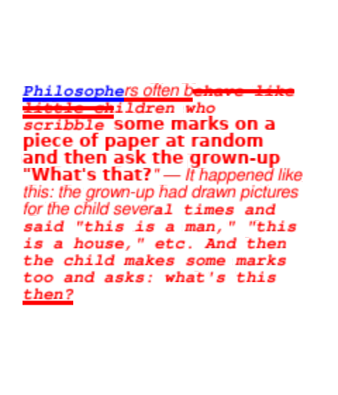
Oh whoops, the lines are too skinny. Easy enough fix.
No, Kronk! The other lever!

Okay, pros: the lines are now at an appropriate thickness! Cons: the lines put themselves just about wherever they please.
Why is it so hard to draw lines under text?
Let’s- wait a second, cosmic-text v0.9.0 just released with breaking changes. Normally I’d complain about this happening right in the middle of what I’m doing, but it removes the bespoke ouroboros dependency, so I’m a happy camper.
After all of that and a little math adjustment, I get this:
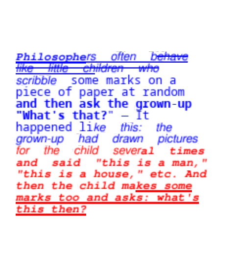
Looks good, but a few small issues:
- Why is the text justified all of a sudden?
- The underlines are too thick.
- The lines start from the top down instead of the bottom up like they do in the
cairoimplementation.
Issues 2 and 3 are a matter of changing a few lines of math. Issue 1 looks to be an actual cosmic-text bug introduced in v0.9.0. Let’s file that. Until then…
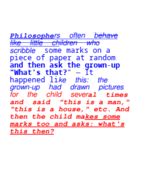
Close enough for government work. The bug seems to be localized to when fonts are switched mid-paragraph, so I’ll just avoid doing that for now.
Holy hell, that was an ordeal. Good God, please give me something easy next…
Number 7: Alignment Ailment
This test aims to test how text alignment works, for both left-to-right and right-to-left text.
Here is the sample version, from piet-cairo:
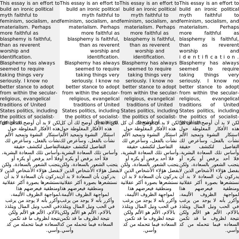
Mhmm, seems like there is some overlapping text. Let’s see how we did…
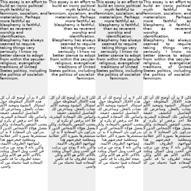
Great! We’re halfway there already, thanks to all the work we did on the last sample. The only thing left to do is to fix the right-to-left text at the bottom.
cosmic-text doesn’t have an option out of the box. Implementing it doesn’t look too hard, though. That’s a PR!
It’s been merged, but it’s not in release yet. So I guess we’ll just wait for that.
Number 8: Font Size Frenzy
The catch with this one appears to be testing multiple different font sizes. There’s also different colors and fonts, but we’ve already tested those.
Here’s what it looks like under piet-cairo:
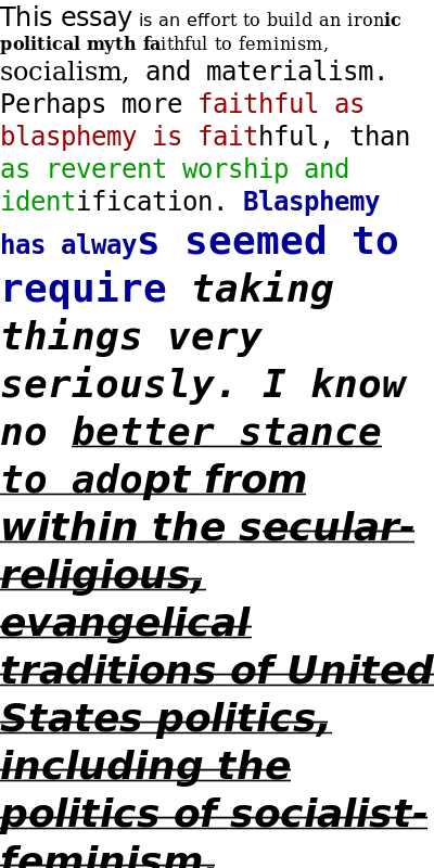
And here’s what it looks like under piet-glow:
…nothing! That’s right, nothing at all! It throws an error and outputs nothing!
This is because cosmic-text doesn’t actually support multiple font sizes in one block of text. Apparently it’s harder to lay out like that. In fact, here’s the code I wrote to handle that:
TextAttribute::FontSize(_) => {
    // TODO: cosmic-text does not support variable sized text yet.
    // https://github.com/pop-os/cosmic-text/issues/64
    error!("cosmic-text does not support variable size fonts yet");
    return Err(Error::Unimplemented);
}
Bah, humbug! Who cares about one little sample. Gotta crack a few omelette to make an egg, right? Let’s just move on to the next sample.
Number 9: Unsizing Ultimatum
This one can’t be too bad, right? It’s just—
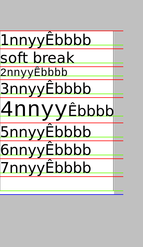
Oh, no. Those font sizes look a little bit variable, don’t they? That means that…
Yep! Nothing! That’s right, I got the exact same error!
So, I guess this means we have to deal with variable sized font in some way. One failing sample would be reasonable. Two would be criminal.
There’s a pull request that adds support for variable sized fonts, but it’s still in its early stages and touches a lot of code. I’d also like to avoid depending on git repositories for now.
Implementing it myself would require a lot of code to be written. Code that would be thrown away once the PR is merged and released.
A simple patch is just to remove the error and make it ignore the changes in font size. It’s not ideal, but for now it has to work.
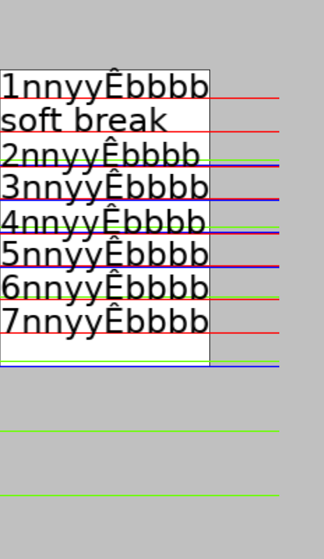
Oh, the little red and green lines are all wrong, aren’t they?
I’ve taken a look at the code, and I think I’ve decoded what it means:
- For each line of text, it returns line metrics.
- The red line represents the “top” of the line.
- The green line represents the “baseline”, where the bottom of most letters end.
- The blue line represents the bottom of the line. I’m not sure why this only appears once?
So it’s only a matter of adjusting the metrics. Easy enough. Right now, my definition of metrics were somewhat off-the-cusp, mostly just to fill in the text rendering trait.
After reviewing the definitions of the LineMetrics struct and adjusting accordingly, here’s what I found:

Whoops, I added the line height to a couple of them by accident. Allow me to fix this:
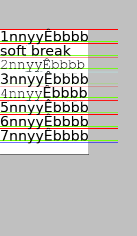
There we are! The last line seems misplaced to me… but you know what, it’s close enough for government work.
For all those reading, in case you’ve wondered why there are hundreds of thousands of lines of code in a text rendering library, this is why. “Correct” text rendering is a very complicated subject.
Say, we never checked in on sample number eight after we “fixed” text sampling, did we? Before we move on, let’s check in on it.
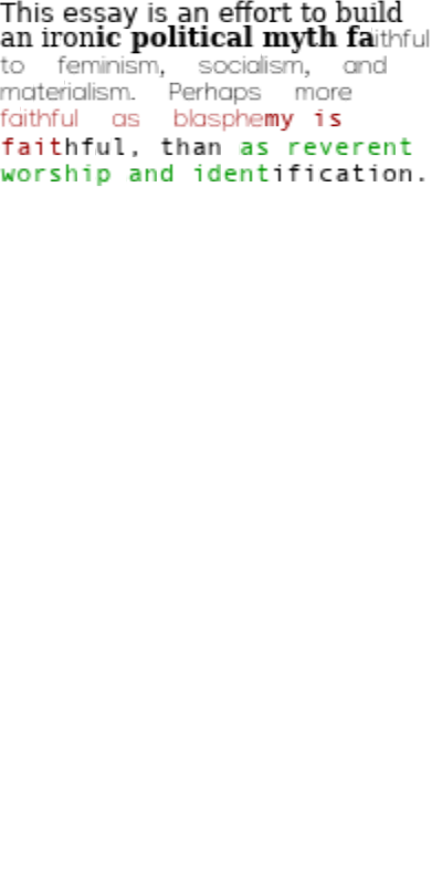
Wait, is part of the text just missing? Grooooaaan
Revenge of the Eighth
Our text is missing! Why is is missing? Well, why not? Why not have text randomly disappear without as much as a warning log message? That seems sensible.
After some slight trial and error, it looks like if I disable the bolding on the latter portion of the text, it renders fine.
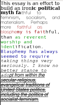
Maybe cosmic-text just doesn’t like it when you have a font with weird bolding like that? I don’t know, and from looking at the code it isn’t immediately obvious why this happens.
Why is this happening? Why isn’t the text showing up? Why isn’t there as much as a log message when this happens? Is it a bug? Is it a feature? What’s wrong with this project? Why have I poured so much time into this? Does everyone spend this much time on text rendering? What happened to Site-13?
The Long Haul
Seriously, what happened to Site-13? When it was originally released in 2015, it was something completely new for the SCP Foundation. It took the long exploration logs previously explored in articles like SCP-093 and really ran with it. The viscerally terrifying exploration logs were like something right out of a Raimi movie, and the sheer scale is still almost unmatched to this day.
But then, in 2018, the original author, djkaktus, added more to the story. He added a handful of exploration logs, followed by a mouthful of interviews. In my opinion, this is one of the worst mistakes in the history of the SCP canon. SCP-1730 already had a very complete arc to it, and these new logs unnecessarily prolonged it. Not to mention, the new logs didn’t really fit the tone all too well.
I don’t want to spoil it, but imagine if Evil Dead ended with an hour-long scene where a handful of cyborg ninjas shows up and beats up all of the Deadites, followed by another hour-long scene where they interview all of the teenagers to figure to what happened.
This tragedy has always been the prime example for me on why you need to reduce your scope. Making your projects too large is hazardous to both your health and your final quality. Even if you manage to finish your project (and for someone as easily distracted as me that’s a big if), what’s left will probably be a bloated mess that’s not worth the effort.
When I originally started getting into Rust in 2019, I identified that there wasn’t a real good solution to GUI in Rust. Therefore, I naively set out to single-handedly create an entire GUI framework, top to bottom, from scratch.
It took a year on flailing about in various aspects of GUI management to find out that this was a bad idea. A GUI framework touches on an absolutely massive number of subjects, from windowing systems to vector graphics to text rendering to fundamental data structures. That’s not even all of it; that’s just the underlying plumbing. When it comes to the parts of the GUI that matter, you need to come up with an incrementalization framework. Good luck doing it in a way that works with Rust’s object model and isn’t an absolute mess to use.
At this point I decide that scope reduction is a good idea. Okay, maybe I don’t want to write the entire windowing system. winit already exists and works well enough; I can just patch it until it fits all of my use cases. Maybe I don’t want to deal with making my own underlying graphics API. piet is in use by druid and it seems to be working for them. Actually, hmm, the default piet implementation, piet-common, doesn’t play well with winit.
Now, here’s a scope that I can shrink down to! It should be easy enough to just write a piet, I foolishly said to myself. Once I implement all of the piet traits, it’ll just be easy, right? Right?
So I put myself to work. The hardest part was writing the OpenGL-based implementation. I explicitly wrote it so that it would be portable to wgpu, so I could just swap out the backend and it would work. For text rendering I figured I could just throw cosmic-text at it Then I wrote a software rasterization backend so that it could work pretty much everywhere. It took a couple of months, but it seemed to work, right? I even used it in a school project of mine.
But then, bug reports started flowing in. Clipping wasn’t working properly, colors weren’t matching up quite right, and text rendering? Forget about it.
So in lieu of tracking all of these bugs down, I noticed that piet had a bunch of samples that it used to test itself. I figured that if I could get all of those samples to work, then I could be reasonably sure that my implementation was correct.
It wouldn’t take too long, right? Just a few little tweaks right? Since I’d already dogfooded it in a school project, it should be fine, right?
Well, you’ve been there for the rest of it.
Frankly, I’m not even sure I want to continue developing that GUI framework I’d planned after this. Not only is the GUI situation much better than it was back in 2019, but I think it’s just too much work for one person to do. Especially as I’ve graduated college now and entered full-time employment, I’m often lacking the time and energy to do it.
I’m not sure what to do at this impasse. I think that this package I’m writing, theo, will be a net positive for the Rust community, as something like it for winit doesn’t really exist yet. So I’ll at least finish it. Maybe that’s just the sunk cost fallacy speaking; I don’t know.
Anyways, we’ve got some text to fix.
Fixing cosmic-text’s Disappearing Font Problem
Anyways, I think I’ve figured out what the issue is, at least on the cosmic-text side.
In text rendering, there is a concept of “font fallback”. It first tries to load whatever font you requested. This loading keeps parameters like boldness, italics and font size in mind. If it can’t find the font you want, or if you’re rendering characters that aren’t in that font, it tries to find another //fallback// font. It starts off with fonts that look like the original font, and eventually starts moving onto whatever fonts it’s hardcoded into the system, just to get //something// onto the screen.
cosmic-text has a system like this, but it turns out that the fonts that it uses as a fallback are missing on my system. Hence, the missing text. Although it is annoying that it didn’t log anything as an error, there’s only one entry buried in the debug log.
I could “fix” this on my system by just installing the fonts, but I’d also like to fix this across all systems. Text not showing up is a pretty big deal, after all. So what if I embed the fonts that I need into the executable itself, so that you’re never without the font that you need to fall back on?
The strategy I ended up using was to download the DejaVu font collection. Then, in the build script I take these fonts, compress them using the Zlib compression scheme (which saved the most space in my experiments) and then put them in the output directory. piet-cosmic-text then uses include_bytes! to embed these fonts into the executable.
From there, it’s just a matter of telling cosmic-text to use these fonts as a fallback. Did that fix it?
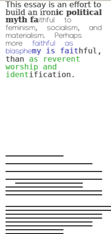
No, it did not.
Apparently, the disappearing font comes not from the font fallback, but from shaping. After some review of cosmic-text’s source code, I think I’ve figured out the real issue. Apparently if the shaper fails to find the ideal glyph ID, it’ll try to shape it again but with another font. If it can’t find that glyph ID in any of the fonts, it’ll just give up and not render anything.
So I set up a loop that checks each rendered glyph to see if they have a “glyph ID” of zero. If they do, it indicates that we need to change the ID for the better.
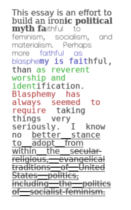
Okay, we’re almost there now. It’s justified again (not my fault) and the spacing between the lines is weirdly bolded (is my fault). A simple patch fixes it.
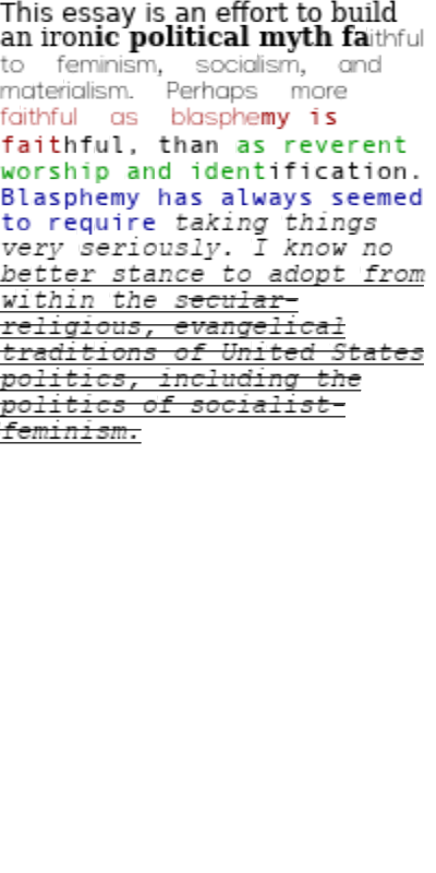
Close enough for me, for now. The font size is still off, but that’s a job for a later version of myself.
Sample 10: Font Decoration Frolic
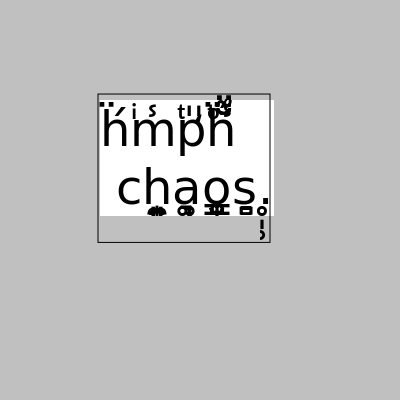
Alright, this has gone on for long enough, and had far too many tangents. This sample aims to demonstrate how text decorations work, especially with Zalgo text. Please, let this be an easy one.
Here’s the reference image from piet-cairo:
Here’s what piet-glow spits out:
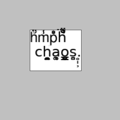
Augh! So close! Aside from being unnecessarily blurry (and maybe rendering a couple of the decorations wrong, but I figure, close enough), it seems that the bounding box of the text is wrong. The white rectangle containing the text should be smaller.
Apparently the black outer rectangle corresponds to the “ink rectangle”, which represents the total extent of the text. The rectangle should go around everywhere the text touches. Meanwhile, the white text is the “logical extent”. Remember when you were writing text between the lines in middle school, before they all switched to using Chromebooks for everything? The logical extent would go from the top line to the bottom line.
The logical extent is relatively easy; hell, when we calculated the line metrics above, we basically already got that. The ink metrics are the harder part, because it’s hard to tell from the parsed font alone. For vector graphics you can figure out the bounding box, and we can take a similar strategy from the raster image.
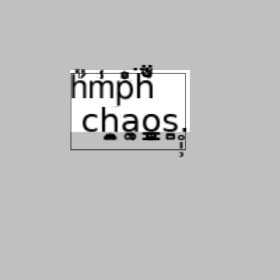
Wow, not even close.
Actually, you know what? We’re long past the point of “doing things right”. You know what the bulletproof way of doing this is? Actually rendering the text, then taking the bounding box of that.
Here’s the candidate for the worst code I’ve written so far:
let mut ink_rectangle = Rect::new(f64::MAX, f64::MAX, f64::MIN, f64::MIN);
buffer.draw(font_system, &mut ct::SwashCache::new(), ct::Color(0), |x, y, w, h, _| {
    ink_rectangle.x0 = min(ink_rectangle.x0, x as f64);
    ink_rectangle.y0 = min(ink_rectangle.y0, y as f64);
    ink_rectangle.x1 = max(ink_rectangle.x1, x as f64 + w as f64);
    ink_rectangle.y1 = max(ink_rectangle.y1, y as f64 + h as f64);
});
Now, I’m not proud of this code. It basically goes through the entire rendering process and created a new cache just to calculate the ink rectangle. Let’s clean it up a little:
- Rather than using
Buffer::draw, I useswash::Scaler, which is howswashcalculates the bounding boxes of the text in the first place. Unfortunately a small amount of rendering takes place, but that’s okay. It puts a permanent dependency onswashforpiet-cosmic-text, which may make it harder to swap out the renderer for downstream crates. - Rather than creating a new
SwashCacheevery time, the shaping context is cached inside of theTexthandle. - We use a hash map to store the bounding boxes of each glyph, so that we don’t have to calculate them every time.
After all of that, we get a decent enough performance boost, followed by a decent enough result:
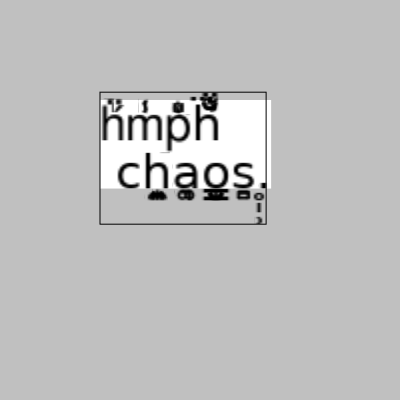
If anything, I’d argue that it’s more accurate than piet-cairo’s sample.
Conclusion
Well, this has been a roller coaster so far, and it’s still far from over. This isn’t even the last we’ll see of text rendering, but I think I’ll try to take a break from it for now. Next time, we’ll see if we can figure out the rest of the samples.
